Evolution of Responsive Design
Written by Gerald Wilhite

It used to be so easy! We designed for a few screen sizes and a handful of browsers.
Then, mobile devices invaded—smartphones, tablets, phablets—all of different shapes and sizes and using different operating systems. Desktop screens from 27 inches down to 7-inch tablets, 5-inch phablets, and 3-inch phones, with all kinds of configurations, brought complexity to design, and that complexity increases every day
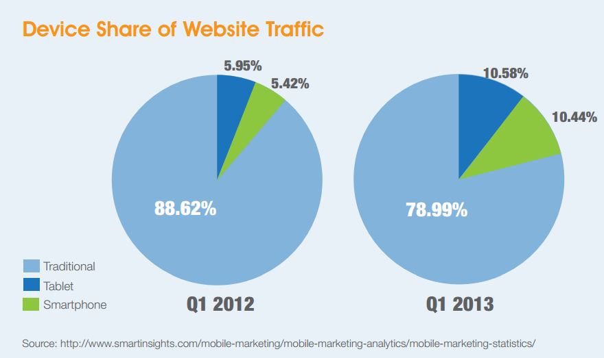
Tablets outsold PCs and laptops in 2013, and, by 2016, mobile Internet usage is projected to overtake desktop Internet usage entirely.
With the additional complications, however, comes good news. At the beginning of 2013, tablet users showed a higher conversion rate than desktop shoppers.*
The good news continues. 75% of mobile users shop on their devices, but when they shop, they expect speed. 74% of shoppers will leave your site within five seconds if it does not render. So, while we talked about the importance of optimizing our sites over the years, now we must resize graphics to display both quickly and correctly over mobile networks.
Not only do mobile and tablet users become frustrated by sites that are not optimized, they also become frustrated with the lack of complete content on mobile sites and the inability to navigate through the full site on their smartphone or tablet. They may very well give up altogether and move to another site.
Over the last few years, many companies created separate, partial mobile sites either to qualify for postal savings or to provide mobile users a taste of their full sites. But as we see how quickly the individual is evolving into this mobile creature, companies are going to need to embrace this metamorphosis more quickly.
Responsive design emerged to address the problems of different screen sizes and various operating systems. Responsive design simply allows the site to respond to the user's behavior and environment based on screen size, platform and orientation. For the mobile user this takes away the frustration of trying to navigate a site that does not fit their device or only having access to a partial site.
Not only do responsive sites mean better customer relationships, Google has also given its blessing to these types of sites. Google goes so far as to recommend responsive web design because it allows a single URL which makes it easier for Google's algorithms to find content and index that content. The best part of this for you is that it is easier for your customers and prospective customers to find you, because these sites rank higher in the search engines.
However, responsive sites need to be closely monitored, so you can move quickly and efficiently as your customer and their technology changes.
This evolution is most certainly going to continue. It's up to you to join the evolution or travel the road of the dinosaur.
Contributors